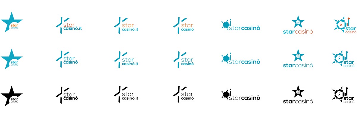
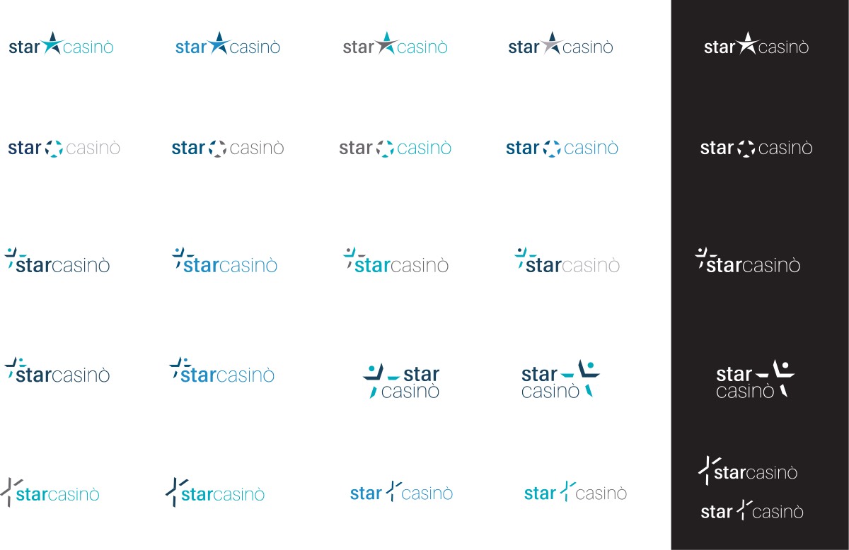
I have been honoured to take part in this task. A few months after starting, Betsson Group decided to investigate a new logo for the brand operating in Italy, Starcasinò. The brief was to make the logo lighter and more modern, using the original colours but on a white background. White comes from the need to make the site a more welcoming place for customers, a place to spend more time. The colours used for the Logotype communicate confidence and security. The first draft of the logo, as it is visible, was created using recognisable casino elements. The other proposals instead turn to a cleaner and institutional approach made dynamic by the use of colours and fonts.
The logo will then be used also in Spain for a short period as starcasino.es. Part of the project was also to create the graphics to be included in the TV commercial.
Client:Betsson Group Skills:Branding, Graphic Design Date: 2015 Location: Malta