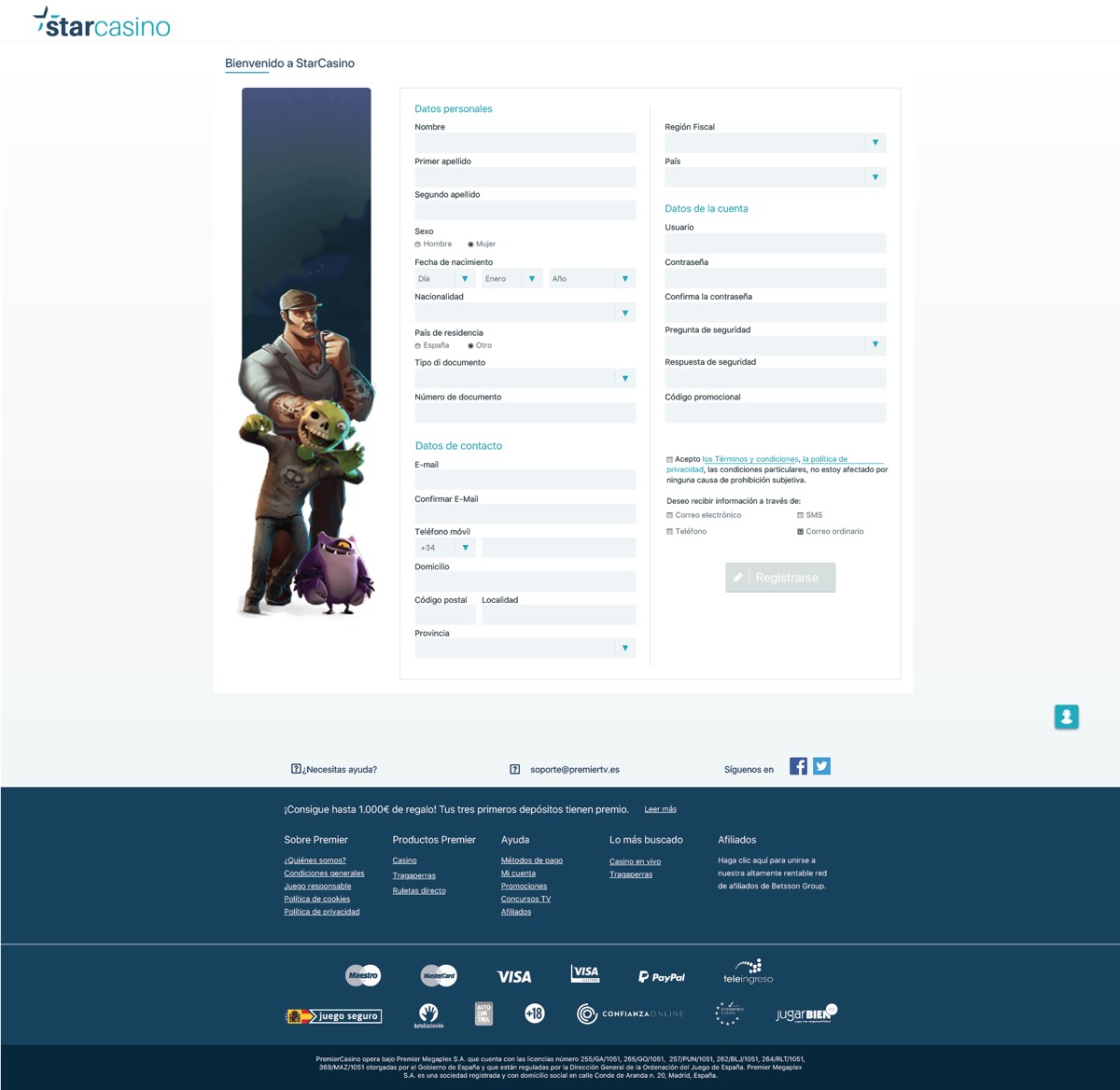
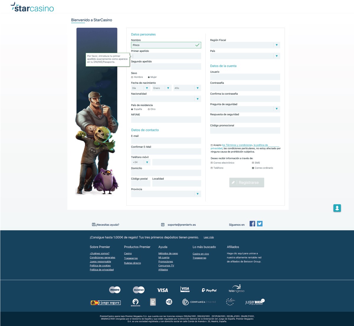
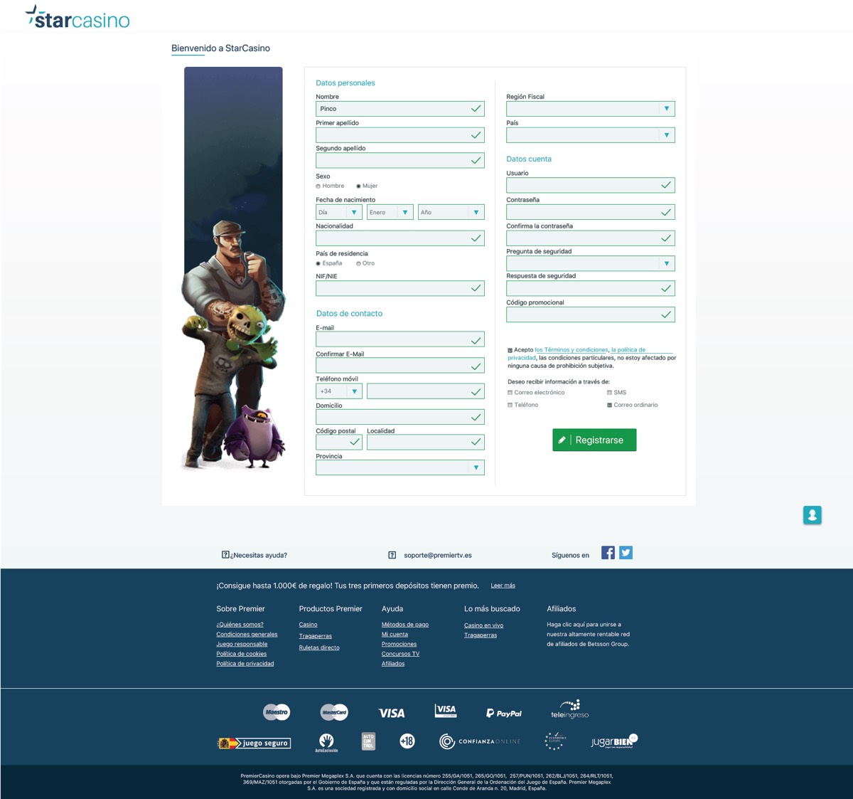
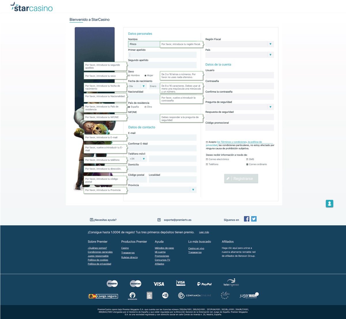
The registration page is always a crucial challenge for every UX Designer. In the world of gambling, especially in regulated markets such as Italy, the UK and Spain, the compilation of mandatory fields could discourage the user. The key is to design a clean and easy to understand interface. Each field is preceded by a label and to the side a Tooltip provides useful information, which helps to reduce confusion and possible compilation errors.
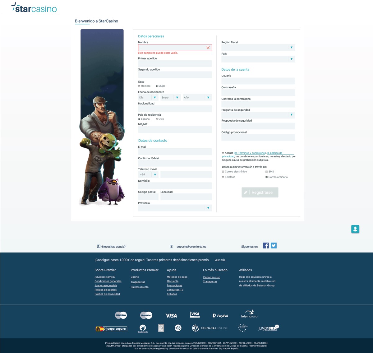
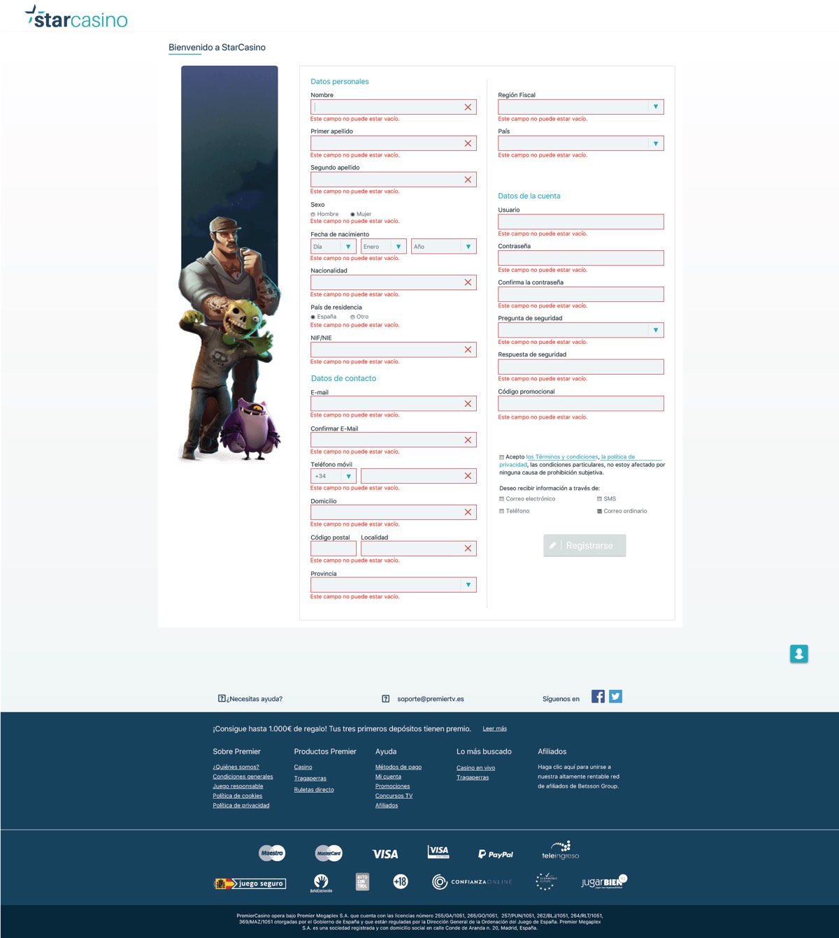
The use of a green line in the outline with the positive flag makes the experience more rewarding. If a field remains empty or incorrect the stroke of the field will turn red supported by the X icon. Only when all of the fields are correctly entered, the Call to Action "Register" at the bottom of the page will be activated, changing colour from grey to green.
The page was also tested (by the analytics team) in 1, 2 and 4 steps and the best was the one with only one step.
Client: Betsson Group Skills: Ui/Ux Design Date: 2018 Location: Malta